
Fed Rate at 5% and Falling Inflation
April 27, 2023
So what happens now that the Fed is at 5%?
As we get closer to the end of the Fed’s hiking cycle, investors are separating into 2 distinct camps. The first camp believes a Fed-caused recession is around the corner and likes the idea of getting 4-5% yields on risk-free cash. Only when the recession is here, and the Fed has cut enough to stimulate the economy, will they allocate back to longer-dated bonds and stocks. The other camp believes that recession risks will be mitigated by a Fed U-turn, leading to outperformance of longer-dated bonds (due to duration) and equities (due to lower discounts and forward-looking stock market) vs cash.
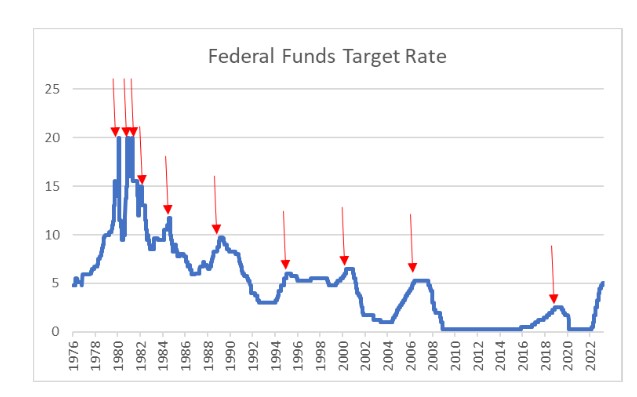
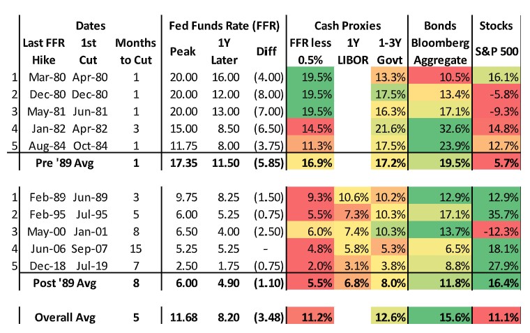
We analyzed ~50 years of Fed, cash rate, bond market and stock market behavior to see if history offers any clues as to who is likely to be right this time around. On average, the Fed has cut rates within 5 months of the last hike, averaging a 3.5% rate decrease from the peak within a year. But reviewing 50 years of data makes clear that there were 2 distinct regimes – pre ’89 and post ’89 – with 2 distinct results for investors. Which result is in store for the next 12 months?
The pre’89 era was characterized by double digit Fed rates (a high of 20%!) and quick U-turns – usually within a month. In the year following the last hike, equities were up 3 out of 5 times, but in all cases underperformed cash. Longer-dated bonds were positive after all 5 hiking cycles as well, but were only able to keep pace with cash 2 out of 5 times. Rate decreases never lasted so duration was not helpful to returns. In short, cash was an investor’s friend due to high absolute rates during this era.
After ’89, the story is quite different. The Fed never broke into double digits and took longer – on average 8 months – to start cutting rates and then cut more slowly. As a result, the calculus for risk assets was completely different. In 4 out of 5 instances, equities outperformed cash 12 months after the last hike, and by substantial amounts. The only negative period was after the dot.com bubble, as valuations continued to correct from astronomic levels. Longer-dated bonds outperformed every time. Overall, investors were well served leaning into risk assets as the hiking cycle ended: on average, cash proxies delivered ~6-8% in the 12 months following the last hike while bonds were up 12% and equities up 16%.
We believe the next 12-24 months may offer investors a similar result as the post ’89 era. The Fed Funds Target Rate will likely top out around 5.25%, not far from the post ’89 average of 6%. Inflation is falling and equity market valuations are not cheap, but no longer excessive. Similar to the last 30 years, we are unlikely to see rate cuts within a month or two as the Fed will want “proof” that inflation is tamed. But at the first signs of unemployment pressure, particularly heading into an election year, the Fed will likely jump into action and support both longer-dated bond and equity prices.
Falling inflation: good short-term but problematic down the road
US CPI fell to 5% in March, marking the lowest it’s been since May 2021. While core CPI remained stubbornly high, we are beginning to see the anticipated “Shelter disinflation” occur as Shelter CPI fell significantly in March. A positive sign for Core CPI, as shelter, is the largest component of core CPI. Additionally, March revealed another month of healthy labor market data, with the US adding 236K jobs and the unemployment rate dropping to 3.5% while job openings crept lower. Many investors will see the trend of falling inflation paired with unwavering labor market data as a positive sign that recession has been avoided and a soft landing is on the horizon. In actuality, it could mean the opposite.
While many aspects of the economy have digested covid and moved on, labor markets are still experiencing prolonged effects. More specifically, the job workers gap – the measure between labor demand and labor supply- hit a record high of 3.7% after the pandemic and has remained elevated since.
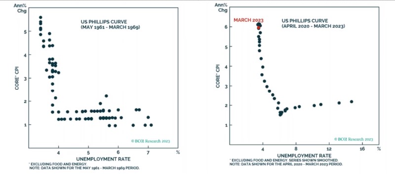
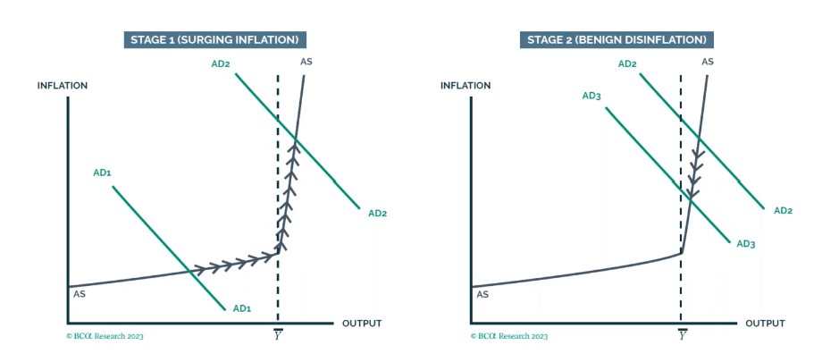
These abnormal labor conditions have revealed a kink in the Phillips curve (figure 1), essentially a non-liner relationship between growth and inflation. In the kinked Phillips curve scenario, inflation will initially grow modestly as demand increases (AD1 in figure 2), but as the economy reaches full employment, the supply curve steepens. As the curve steepens, an environment is created in which firms are forced to increase wages to keep pace with demand, leading to surging inflation (AD2), such as what happened in 2022. The Fed then raised interest rates to combat the surging inflation, bringing us roughly to today. As demand gradually falls, we should also expect inflation to fall while employment remains strong (AD2 to AD3). This will seemingly create a Goldilocks scenario in which inflation normalizes without affecting employment. Many investors may even believe that we have successfully navigated a soft landing. But as demand continues to fall down the supply curve, we will reach the kink in the curve. At this point, any decrease in demand will result in much more significant declines in output and employment, likely leading to a recession.
Exactly when the US economy will reach the kink in the supply curve is unknown. It’s possible that excess household pandemic savings and strong labor markets could help in propping up demand for longer, thus, keeping the US in the aforementioned “goldilocks” scenario for longer. In the short term, we remain positive on equity assets, as we expect inflation to continue to fall and employment to remain stable. In the long term, we look to become more tactical as we look for employment data to deteriorate.
DISCLAIMERS & DEFINITIONS
The information provided is for educational purposes only. The views expressed here are those of the author and may not represent the views of Leo Wealth. Neither Leo Wealth nor the author makes any warranty or representation as to this information’s accuracy, completeness, or reliability. Please be advised that this content may contain errors, is subject to revision at all times, and should not be relied upon for any purpose. Under no circumstances shall Leo Wealth be liable to you or anyone else for damage stemming from the use or misuse of this information. Neither Leo Wealth nor the author offers legal or tax advice. Please consult the appropriate professional regarding your individual circumstance. Past performance is no guarantee of future results.
This material represents an assessment of the market and economic environment at a specific point in time. It is not intended to be a forecast of future events or a guarantee of future results.
Indices are unmanaged and investors cannot invest directly in an index. Unless otherwise noted, performance of indices do not account for any fees, commissions or other expenses that would be incurred. Returns do not include reinvested dividends.
The Standard & Poor’s 500 (S&P 500) is an unmanaged group of securities considered to be representative of the stock market in general. It is a market value-weighted index with each stock’s weight in the index proportionate to its market value.
The Bloomberg Barclays US Aggregate Bond Index, or the Agg, is a broad base, market capitalization-weighted bond market index representing intermediate term investment grade bonds traded in the United States. Investors frequently use the index as a stand-in for measuring the performance of the US bond market.
The Consumer Price Index (CPI) is a measure of inflation compiled by the US Bureau of Labor Studies
The Phillips curve is an economic model, named after William Phillips hypothesizing a correlation between reduction in unemployment and increased rates of wage rises within an economy.